Last week, we looked at examples of eCommerce websites that we love. No matter the industry, we found invaluable tools and practices to really drive eCommerce digital strategies.
But what if you don’t have eCommerce? What if your website, or even your business model, isn’t a digitally-driven revenue source?
We have some great examples for you, too.
Southwest Airlines
More specifically, we love the Southwest Heart site that promotes the new look and feel of the Southwest “heart” (read: brand). Not only is the design simple but it mirrors the personality of Southwest.
http://www.southwest-heart.com/
Rebranding is difficult and many brands lose the efficacy of the transition because of the marketing. With Southwest’s Heart site dedicated to informing the public about the new brand look and attitude, they’ve created a stable launch point. People can feel confident that while the looks have changed, the service is still the same.
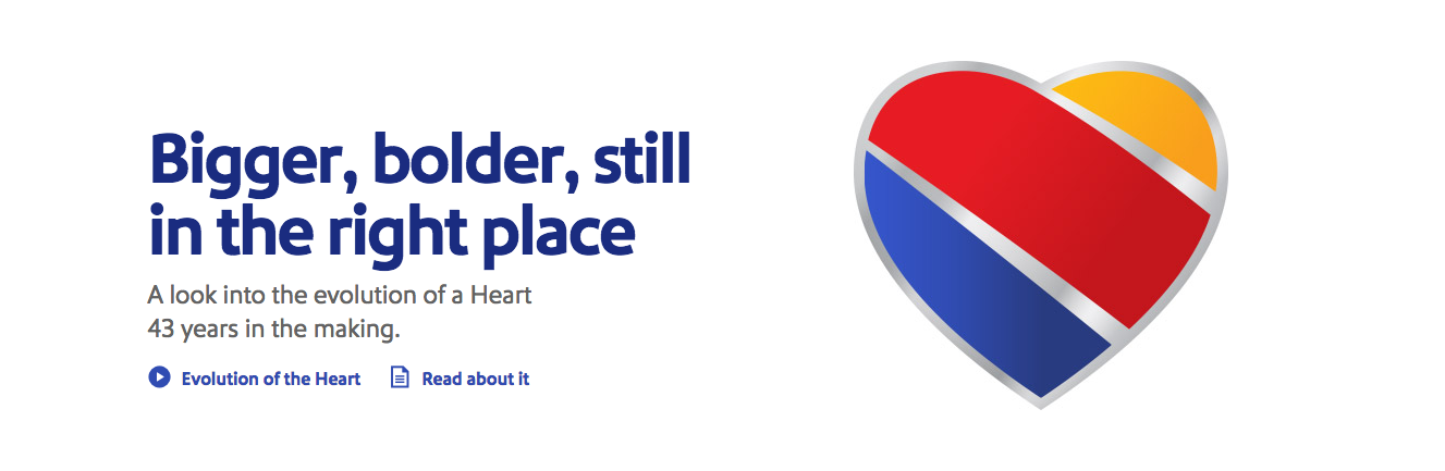
What we love:
>> Onsite Q&A! Checkout the almost animated functionality of this page and the questions Southwest has anticipated from the customer base. The expanding answer fields keep the layout simple while allowing the user to engage with the questions that matter most. (More engagement, more time-on-site, more brand loyalty!)
Kinfolk
When it comes to absorbing content, less is more (on the side of design). Whether you have an active blog or contribute to a content engine of another sort, we think you’ll love the design and layout of the Kinfolk website.
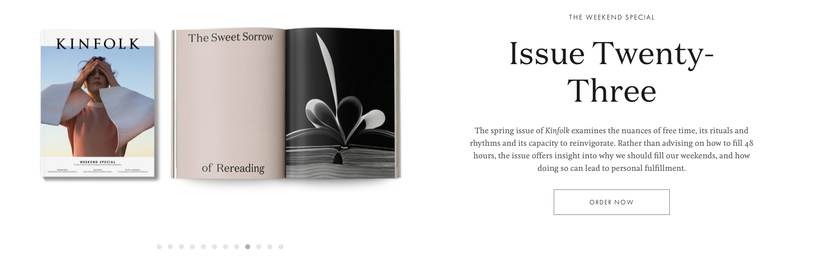
What we love:
>> For a site with large amounts of content and high-quality imagery, Kinfolk keeps the design responsive and clean. The Pinterest-style card format of content cards makes it easy to browse for a topic or genre that piques your interest without getting overwhelmed in the top fold.
Added bonus: Kinfolk has incorporated multimedia and profiles for their design staff. If you like the look of their designer pages, you should see what we can do!
Did you notice how many of the websites are secure? Google is rolling through phase 2 of the SSL certificate penalties and it’s starting to show!
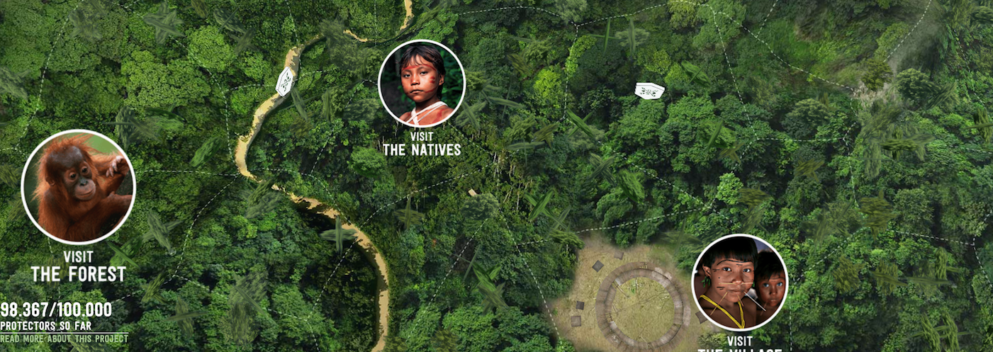
Rainforest Guardians
While it has nothing to do with design, it does teach us everything we need to know about communicating causes and interactive websites. A foreign website Webby award winner, the Rainforest website is simple yet powerful. We jumped right into the interactive tour of the rainforest and villages. Before we know it, we were 20 minutes deep into this project. Res ipsa loquitur: The visual speaks for itself.
http://rainforest.arkivert.no/#kart
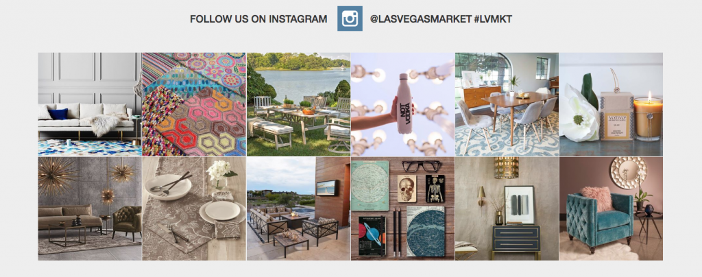
Las Vegas Market
Twice a year, we all spend weeks browsing the updated Las Vegas Market website. When we started our pre-market browsing in January, we were blown away by the new design! Call to actions, card-style layout, social media feed, and more! Where do we even begin?
What we love:
> The home furnishings industry is one of the most visually-pleasing industries to work in. Many of the team at MicroD always feel incredibly under-dressed at every market because the beautiful furniture outshines even the most dazzling ball gowns. With such a sensory experience at market, it can de difficult to share that culture online. Not in this case. One of our favorite parts of this website design is the Instagram feed. While it’s not a new phenomenon, we’ve all seen one-too-many websites with a dull (or outdated) social media feed rolling on the homepage. Las Vegas Market has one of the most spectacular feeds: colorful, vibrant, detailed, inspiring, and unique. If you’re looking for the right way to incorporate social media feeds to your website, this is your example!